views
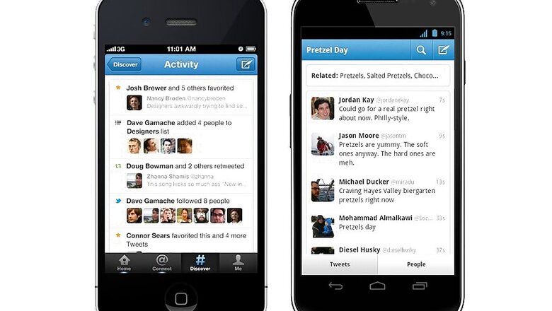
Micro-blogging website twitter is set to roll out a new look for its Android app with a material design developed by Google. The material design makes use of grid-based layouts, responsive animations and transitions, padding, and depth effects such as lighting and shadows.
The app will now be split into four tabs – Home, Moments, Notifications and Messages, you can switch between them by tapping the icons at the top of the screen, or using a horizontal swipe. Dragging across from the left-hand edge will reveal a side menu with shortcuts to your profile, lists and Twitter highlights.
A revamped look and feel for our @Android app, now rolling out globally! See what's new: https://t.co/MOaWKJgjqc pic.twitter.com/snL8pBLnDL— Twitter (@twitter) June 7, 2016
The drop-down arrow at the top of the menu will let you switch accounts. There will also be a new floating action to allow users to easily send a tweet.
Twitter has said that the new design is rolling out to everyone on android and will be available after an app update.


Comments
0 comment