views
Planning Your Display Board
Know the rules and/or regulations. When you are creating a display board for a science fair or school event, there may be certain items that are required to be on your board. Make sure you know what these items are so you can prepare and plan for them. Items may include: your name, your grade level, your teacher's name, acknowledgements, etc. You may also be required to display items beside, but not on, the board, such as lab notes, equipment, examples or prototypes, etc. Also make sure you're aware of any items that are not allowed on your display board.
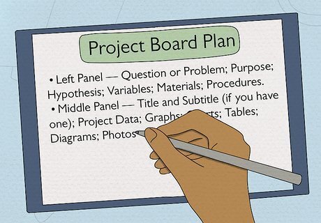
Create a detailed plan of your project and board. Before you can create your project board, you need to decide what items you're going to display on it, and how you're going to display those items. This part of your plan will depend on the type of project you're working on. One way to develop a detailed plan is to create a storyboard. A storyboard is a graphical representation of what your board may look like, or how it will be organized, drawn on paper. Review your whole project and determine what the major sections or parts were. These sections may end up being what you want to display on your board. When creating your storyboard, plan out what font sizes you want to use for each item. This will help make the creation and printing of each section quicker and easier. Many science fairs suggest that topics should be listed as follows on display boards: Left Panel — Question or Problem; Purpose; Hypothesis; Variables; Materials; Procedures. Middle Panel — Title and Subtitle (if you have one); Project Data; Graphs; Charts; Tables; Diagrams; Photos; Illustrations. Right Panel — Analysis; Results; Discussion; Conclusion; Recommendations; Future Studies; References.
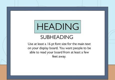
Use headings and subheadings. Large amounts of text should be broken up with subheadings in order to make reading the material easier. Ideally, a viewer should be able to glance at the headings and subheadings on your display board and know exactly what your project was about, without having to read all the detail. Take these headings and subheadings into account when planning what material you need for your board. Use at least a 16 pt font size for the main text on your display board. You want people to be able to read your board from at least a few feet away. Headings and sub-headings should be printed in larger font than the main text, and it is also helpful to use bolding, underlining, or colours to make them stand out. It's also helpful to write items in lists or point form so they can be skimmed. Make these concise.
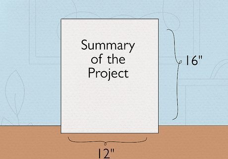
Determine if you need a buddy board. A buddy board is a small board that sits in front of, or beside, your main display board. It can be useful for displaying a summary of the project, or a photo showing project results. The buddy board should be 9” tall by 12” wide (which would fit one letter-sized piece of paper with space left around the edges). You can make your own buddy board using foam boards cut down to the proper size (with an x-acto knife). You can use another small piece of foam to make a stand. Attach the stand to the board using tape.
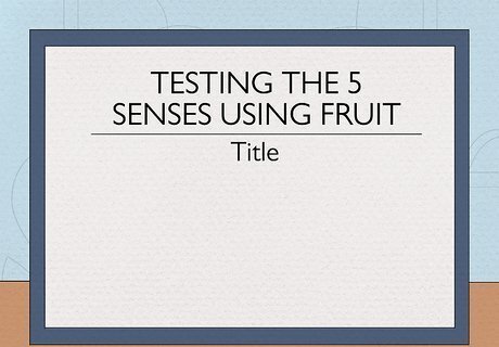
Select the right title for your project. The title needs to do two important things: attract attention and explain what the project was about. Be creative, and take your time. Write down a list of possible titles and play with the wording until you feel you have the perfect title. You might want to use a thesaurus to come up with catchy or descriptive words that work well for your project. However, you should look up any words you find in a dictionary to find the precise meaning, because thesauruses group very loose synonyms together. While it may not be possible to have a really short title, try to keep the title as short as you can. You want viewers to be able to read the title at a glance, while also drawing their interest. Examples of some good project titles are: Can your timber take the pressure? Staying Power - Lipstick or Gloss Bacterial content of milk Testing the 5 senses using fruit
Creating the Details
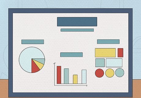
Use as many visual items as possible. Words are great, but pictures say much more. Include as many pictures, graphs, tables, charts, diagrams, etc., as possible. Keep your backgrounds (i.e., whatever is behind your graphics and text) simple and subtle. Reading the text that is on top of a colourful or complex background can be difficult and distracting. Try to print as many of your graphics in colour as possible, especially graphs and charts where the colour distinguishes between different items or variables. If you don't have access to a colour printer, you can use markers or crayons to add color to things like graphs and charts.
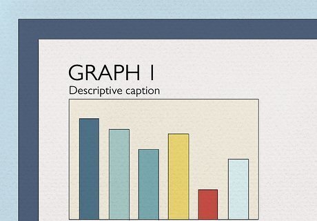
Label all your graphs, charts and photos. Each visual item (graph, chart, table, diagram, picture, etc.) should have its own number (or letter), plus a descriptive caption. When the main text refers to a specific visual item, that number or letter should be used. The caption should accurately and quickly describe what is contained in the visual item, and can be printed in slightly smaller font (less than 16 pt).
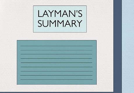
Include the proper terms and jargon. Your main text and captions should include the technical or scientific names, terms and jargon for the discipline your project is based on. If necessary, you can also include a glossary of terms on your display board or in your project report. Using the proper terms is especially important if your project is being displayed in a science fair or event that is being judged by professionals. If your project is really complex, you can also include a 'layman's summary' as part of your display which sums up your project in language anyone can understand. This is particularly useful if your display board is also being viewed by fellow students, parents, or non-professionals.

Remember that less is more. It can be tempting to get really creative and eccentric when creating a project display board, but try to avoid the temptation! A good project display board is one that is uncluttered, has easy-to-read and clear material, contains graphics that effectively explain your project, and colours that don't overwhelm the viewer. Search the web for example display boards to get an idea of what works well, and what doesn't. Ask your teacher for advice on what to do and not to do, and for examples of project boards that previously received awesome grades.
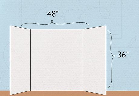
Buy the proper display board. Display boards come in a standard size of 36” tall and 48” wide. You can buy or make larger (or smaller) boards, but make sure the size is not only appropriate for your display but also allowed by the event (if such rules exist). These display boards have three panels - the middle panel which is half the width of the whole board, and the two outside panels that are a quarter of the width each. The two outside panels can fold over the middle panel to close the board for transport. And the outside panels can be used to stand the whole display board upright on a table. You can find display boards at online retailers like Amazon.com or at your local school supply store. Bigger is not always better. Boards that are really tall or really wide may be difficult to read and/or contain too much information.
Putting it All Together
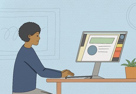
Develop all your materials on a computer. Unless your project board is for an art project or is it a requirement of the assignment, all your materials should be developed (and then printed) from a computer. You should avoid creating the materials by hand, as it doesn't look as professional. You should already know what materials you require for your display board based on your overall plan and storyboard. You can create your materials in a variety of software on the computer, including word processing, spreadsheet, or presentation software. You can also consider using more specialized software like Adobe Photoshop or iPhoto if you're familiar with the software. If you don't have access to a computer at home, you can usually use one at school or at public libraries. When creating each section of material, use the Page Setup of the software to display the page in the same orientation as it'll be on your project board. You can choose between horizontal (landscape) or vertical (portrait). Try to fit one page on your screen at a time to enter and size the material, so you can see how the overall section will appear when it's on your board. Use san-serif fonts like Arial, Verdana, etc., or simple serif fonts like Times New Roman, Georgia, etc. Avoid script fonts or fancy fonts that are hard to read.
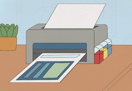
Print all your materials. Once all your material is created and designed on your computer, you can print each item. Ideally, the material should be printed on a colour printer, but if you do not have access to one, make sure your material is designed in grey tones so you know exactly how it will appear when printed. If necessary, you can save all your material onto a USB thumb drive and take it to school or a printing/stationery store to be printed. If you have the ability, consider printing your material on thicker paper or paper that isn't plain white. Keep in mind that standard printer paper is quite thin, and if you're using glue to attach the items to your display board, the glue may show through this type of paper. Try not to use bright coloured paper for printing. Or, if you do, make sure the font colour can be properly seen on top of the colour. Black font on a dark coloured background, or white font on a light coloured background, can be very difficult to read. Use the computer spellcheck on your material and manually check your spelling and grammar to make sure there are no mistakes before printing your material. If you're printing photos on photo paper, consider using matte photo paper instead of glossy. The glossy photo paper can cause a glare to appear on your photos, which can be distracting.
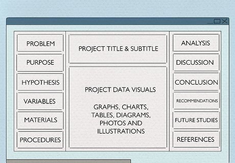
Create a layout design. At this point, you know what information you're going to put on your display board, but you still need to figure out how to lay it all out. Lay your display board flat on a table and place your material around on the board in different layouts until you find one you like. Don't start attaching your material to the display board until you're certain you have the right layout. The layout, in general, should read almost like a newspaper article - top to bottom and left to right. The title of your project should stand out on the board so it can be read from a distance. Avoid spelling the title vertically, as vertical letters are harder to read at a glance.
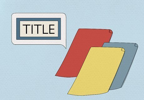
Use coloured paper to create shadows, borders and silhouettes. If possible, consider getting coloured paper (like construction paper) to create a border around some or all of each section of material you're placing on your display board. You'll want to choose a consistent colour (or a set of two complementary colours), and it should be colours that go well with the colour of the board itself (e.g., don't use black paper for borders if your display board is black.) Be careful with your colour choices. Really bold colours, especially more than one of them together, can be distracting and hard to look at. Use a colour wheel to pick the colours you want to use. You can find many colour wheels online.
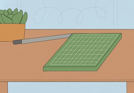
Cut materials straight. This may seem like a rather obvious step, but cutting paper using scissors, even if you've drawn a line in advance, can still not turn out straight. Ideally, cut all your materials using a paper cutter or trimmer. Your school will probably have a paper cutter available somewhere that you can borrow. Ask your teacher. Printing and stationery stores sometimes have paper cutters and trimmers available for use. If you know someone who does a lot of scrapbooking, they may have a paper trimmer you can borrow.
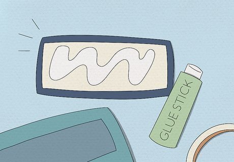
Glue items to your display board. Glue sticks are the best adhesive to use for a project display board. But you can also use double-sided tape. Regular craft glue is not recommended as it can show through the paper and be lumpy, causing your display to look unprofessional. If you want to use the photos on your display board again, you could consider using adhesive velcro dots instead of glue. You can also use rubber cement. A parent or older person will probably have to purchase it for you, though.
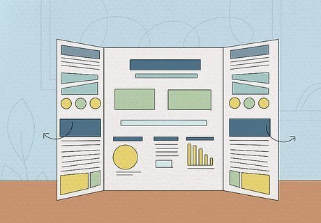
Be aware of how you place your board. When displaying your board on a table or desk, make sure the room's lighting doesn't cast a shadow across your board. Adjust the placement of the panels (and the title board - if you have one) until your whole board is brightly lit. Also make sure to keep the side panels tilted outwards, not at 90-degree angles to the middle panel. You want to make sure the viewers can see all three panels without having to twist their heads in awkward positions.









Comments
0 comment