
Open Microsoft Excel. Its app icon resembles a green box with a white "X" on it.
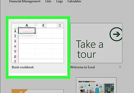
Click Blank workbook. It's a white box in the upper-left side of the window.
Consider the type of graph you want to make. There are three basic types of graph that you can create in Excel, each of which works best for certain types of data: Bar - Displays one or more sets of data using vertical bars. Best for listing differences in data over time or comparing two similar sets of data. Line - Displays one or more sets of data using horizontal lines. Best for showing growth or decline in data over time. Pie - Displays one set of data as fractions of a whole. Best for showing a visual distribution of data.
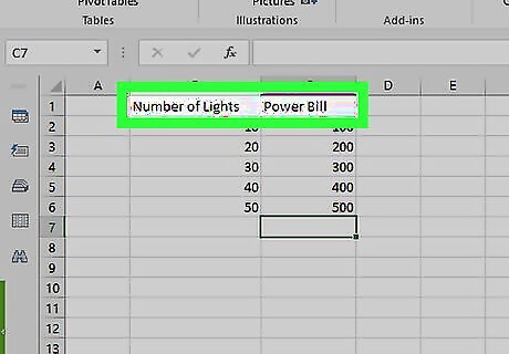
Add your graph's headers. The headers, which determine the labels for individual sections of data, should go in the top row of the spreadsheet, starting with cell B1 and moving right from there. For example, to create a set of data called "Number of Lights" and another set called "Power Bill", you would type Number of Lights into cell B1 and Power Bill into C1 Always leave cell A1 blank.
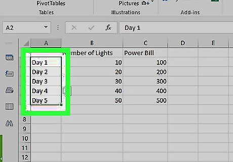
Add your graph's labels. The labels that separate rows of data go in the A column (starting in cell A2). Things like time (e.g., "Day 1", "Day 2", etc.) are usually used as labels. For example, if you're comparing your budget with your friend's budget in a bar graph, you might label each column by week or month. You should add a label for each row of data.
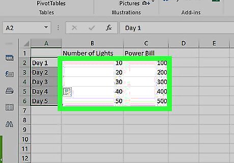
Enter your graph's data. Starting in the cell immediately below your first header and immediately to the right of your first label (most likely B2), enter the numbers that you want to use for your graph. You can press the Tab ↹ key once you're done typing in one cell to enter the data and jump one cell to the right if you're filling in multiple cells in a row.
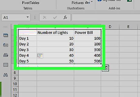
Select your data. Click and drag your mouse from the top-left corner of the data group (e.g., cell A1) to the bottom-right corner, making sure to select the headers and labels as well.
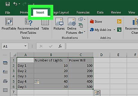
Click the Insert tab. It's near the top of the Excel window. Doing so will open a toolbar below the Insert tab.
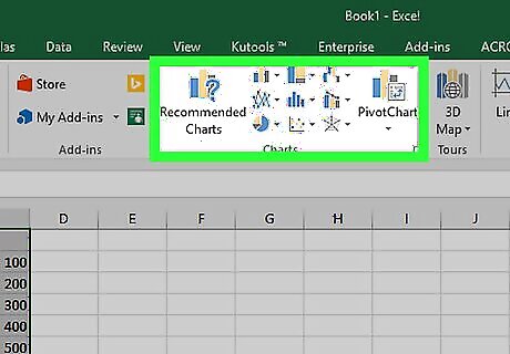
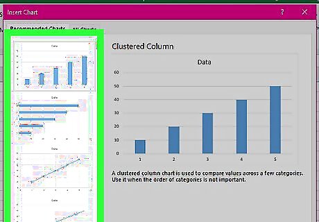
Select a graph type. In the "Charts" section of the Insert toolbar, click the visual representation of the type of graph that you want to use. A drop-down menu with different options will appear. A bar graph resembles a series of vertical bars. A line graph resembles two or more squiggly lines. A pie graph resembles a sectioned-off circle.
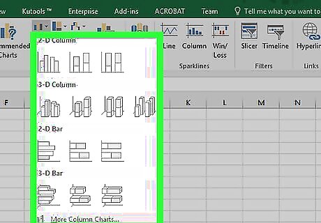
Select a graph format. In your selected graph's drop-down menu, click a version of the graph (e.g., 3D) that you want to use in your Excel document. The graph will be created in your document. You can also hover over a format to see a preview of what it will look like when using your data.
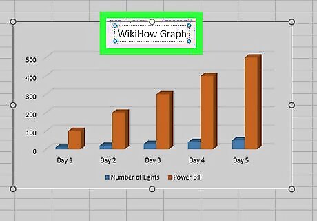
Add a title to the graph. Double-click the "Chart Title" text at the top of the chart, then delete the "Chart Title" text, replace it with your own, and click a blank space on the graph. On a Mac, you'll instead click the Design tab, click Add Chart Element, select Chart Title, click a location, and type in the graph's title.

Save your document. To do so: Windows - Click File, click Save As, double-click This PC, click a save location on the left side of the window, type the document's name into the "File name" text box, and click Save. Mac - Click File, click Save As..., enter the document's name in the "Save As" field, select a save location by clicking the "Where" box and clicking a folder, and click Save.


Comments
0 comment