209
views
views
Apple is said to have an eye for design, but perhaps that attention to detail doesn't extend to designing representations of rivals' logos.
Apple is said to have an eye for design, but perhaps that attention to detail doesn't extend to designing representations of rivals' logos.
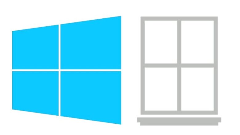
Hungarian tech blog Szifon noticed this rather strange looking Windows logo on Apple's iCloud support pages.
The Microsoft Windows logo, on the Apple website looks, well... like an actual window, complete with a ledge.
The only semblance to the actual Microsoft Windows logo are the four panes.

This change appears to have been made sometime after March this year according to snapshots from the Internet Archive's Wayback Machine.


Comments
0 comment